In development · first release planned for Q4 2026
The visual rebuild of SoftwareCentral finished everywhere except one place: the Shop. This is that last chapter — and rather than show it to you when it is finished, we would like your opinion while it can still change.
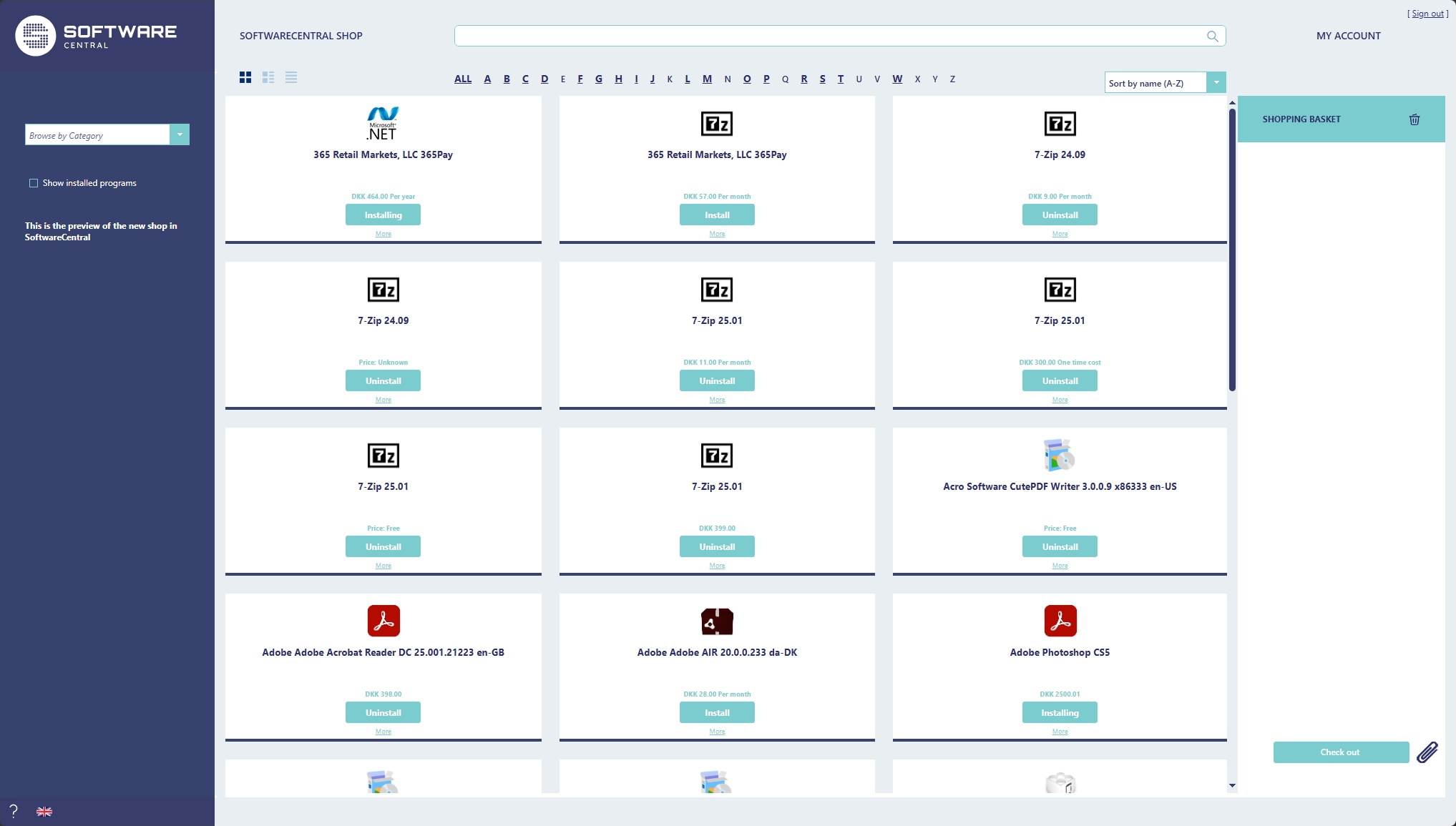
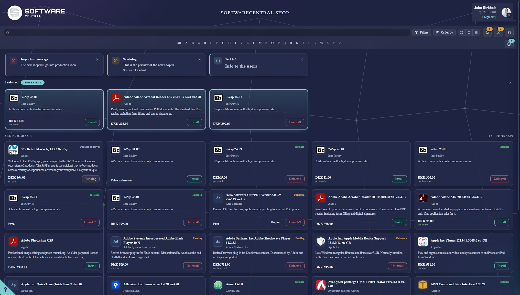
Drag the handle — or click anywhere on the picture. It takes the arrow keys too.
Two things worth knowing before you scroll.
Nothing here will replace anything. The new shop will run beside the shop you use today, on the same catalogue, the same categories, the same approval flows and the same orders. There will be no migration project and no data to move — when you are ready you point your users at the new one, and if you are not, you do not.
None of it has been released. The new shop is in development and the first version you will be able to install is planned for Q4 2026. Everything up to What we are building next is built and working in our own environment; that last section is not. Each section says plainly which it is, because a preview that oversells is worth nothing to either of us.
The old shop was built before the rest of SoftwareCentral was redesigned, and it had begun to show. The new one is built on the same design language as the Application Manager and the dashboards — the same palette, the same spacing, the same controls — so moving between them no longer feels like moving between two products.
It is a real page in the product, not a skin over the old one. But it reads the same data: your packages, your categories, your prices, your approval rules, your order history.
Dark mode arrived across SoftwareCentral in 26R3.1. The shop has it too, on the same switch and the same per-user setting — one colleague can work in dark while the next stays in light, and the choice follows the person rather than the installation.
The theme is applied before the page is drawn, so there is no flash of the wrong theme while a page loads. If you are curious what that feels like, the button at the top of this page does the same thing to this page.
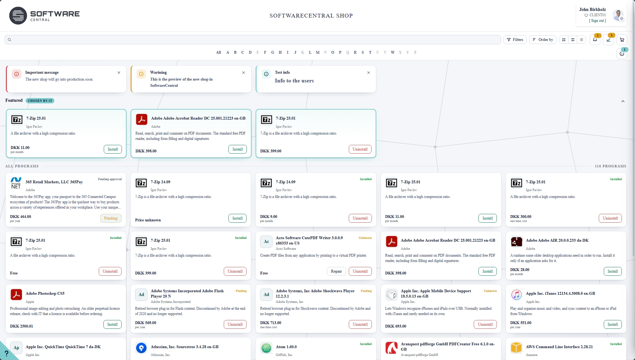
Drag across to change the theme on half the shop at a time.
The shop you use today has a handful of colour settings — a background, a font colour, a button or two. They were added one at a time over the years, they never quite covered everything, and a shop with all of them filled in still did not look like your organisation.
The new shop is built on one set of colour tokens rather than colours scattered through the markup, and that makes a much better answer possible: a theme. A theme is a complete look — both modes, a logo, a name — and you build it in a designer that shows you the real shop while you work.
The left of the page is the editor. The right is the real shop, running live, with your own catalogue in it — not a mock-up and not a strip of swatches. Move a colour and it repaints as you pick, so you are looking at the thing your users will see rather than imagining it.
Nothing is stored until you press Save, and the shop in the preview cannot place an order, so you can click around it as freely as you like.
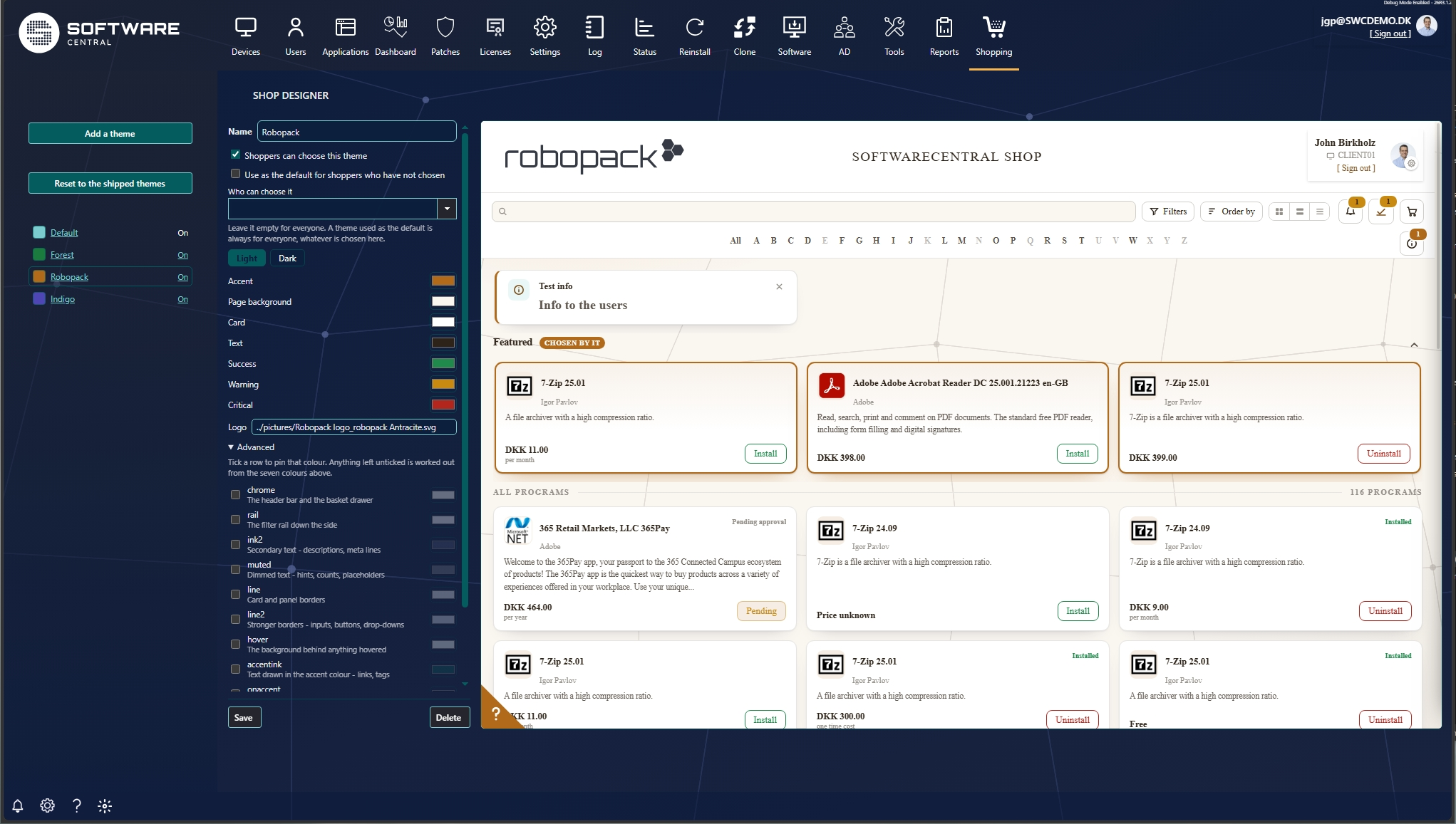
You pick seven colours for each mode — the accent, the page, the cards, the text and so on. Everything else is worked out from them: borders, hover states, quieter text, the shade a card takes when you point at it. Changing the accent moves the whole shop with it, which is what makes a decent theme a two-minute job rather than an afternoon.
When seven is not enough, an Advanced list opens every individual colour the shop uses, each shown beside its built-in value, and you can pin the ones you want to set by hand. Most people will never open it. The people who do are the ones who would otherwise have written to us asking for a stylesheet.
A theme carries a full palette for each mode, because a colour chosen against white rarely survives being put on near-black.
It carries a logo for each mode too, and that matters more than it sounds. A single-colour logo has to be inverted to stay visible in dark mode, and inverting a red logo gives you a cyan one. Give the theme both files and neither mode has to make do.
You can build as many as you want and switch them on and off as you go. One is the default — what somebody sees who has never chosen — and your users pick from the rest themselves, in the same settings panel as their language and their light or dark preference.
Three themes ship with it: Forest, Amber and Indigo. The shop's own built-in look sits beside them and can be edited like any other. They are there so there is something to choose on the first day, and something to copy rather than starting from an empty palette.
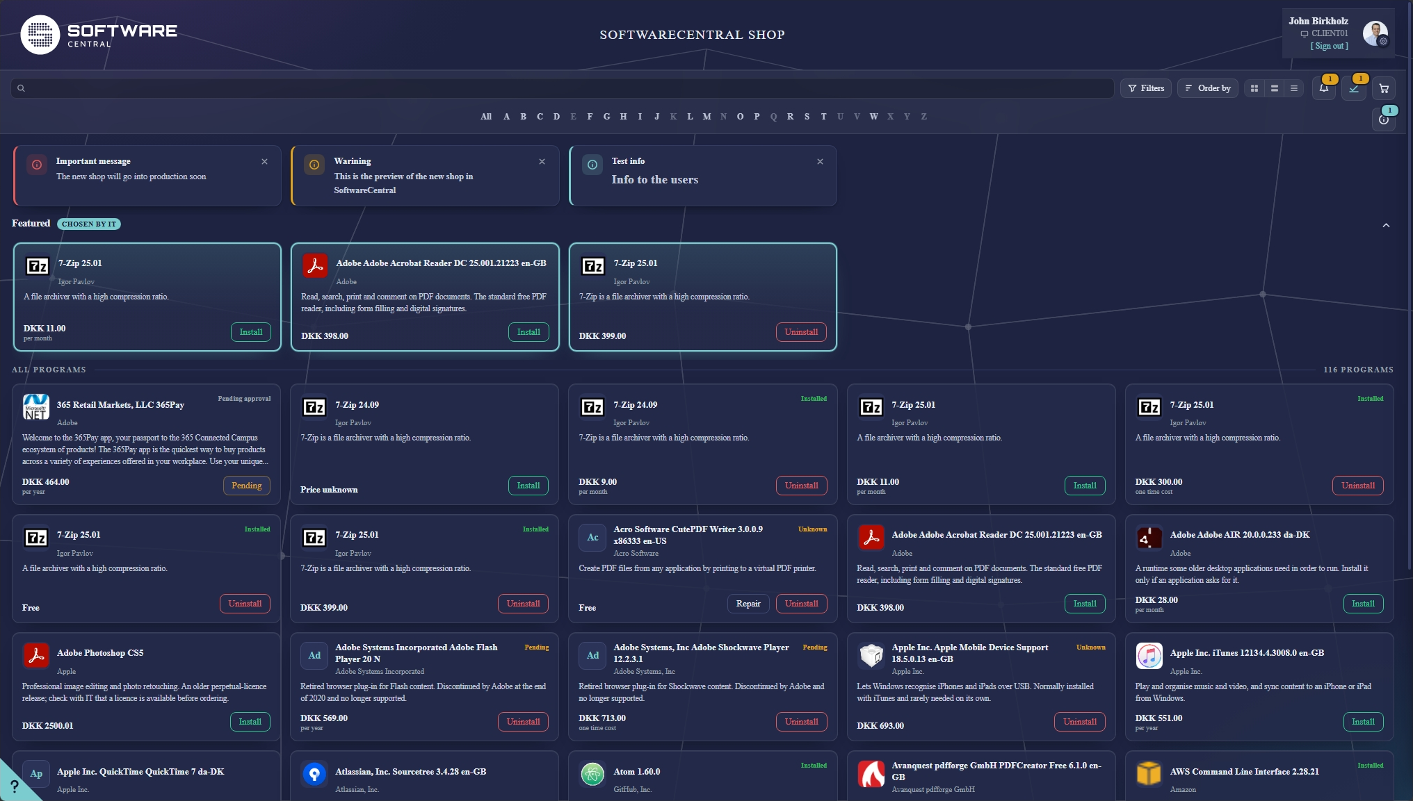
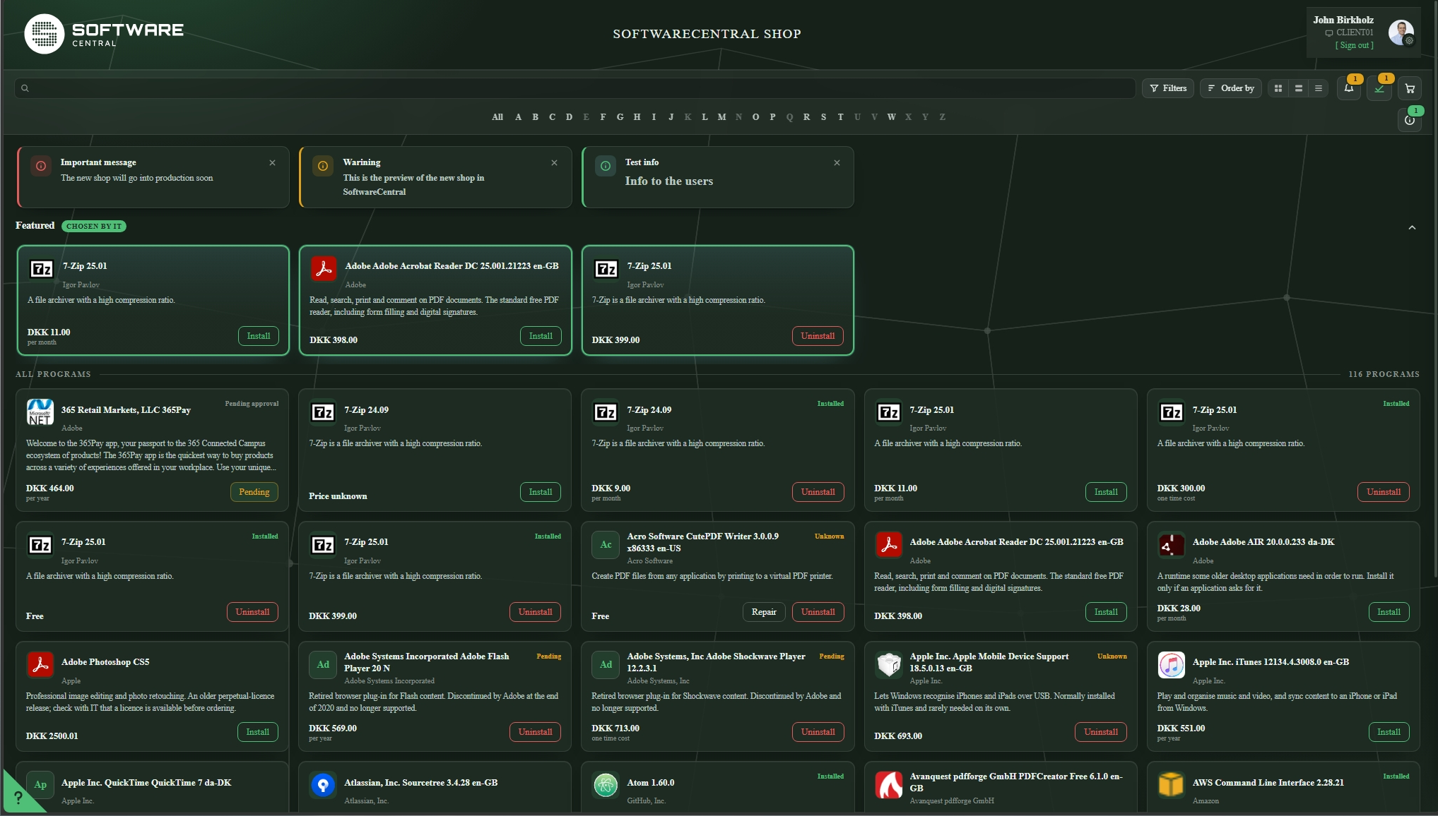
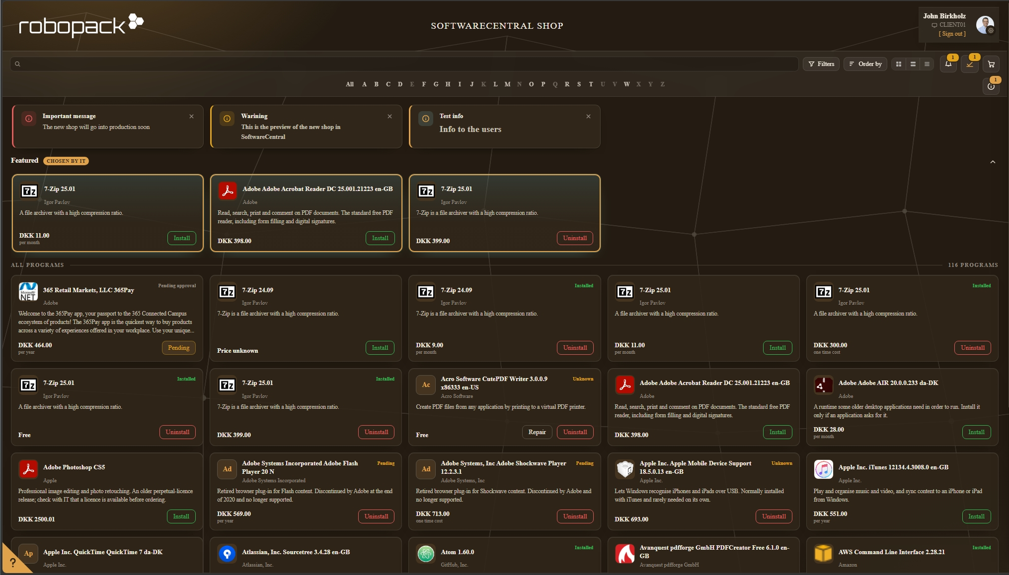
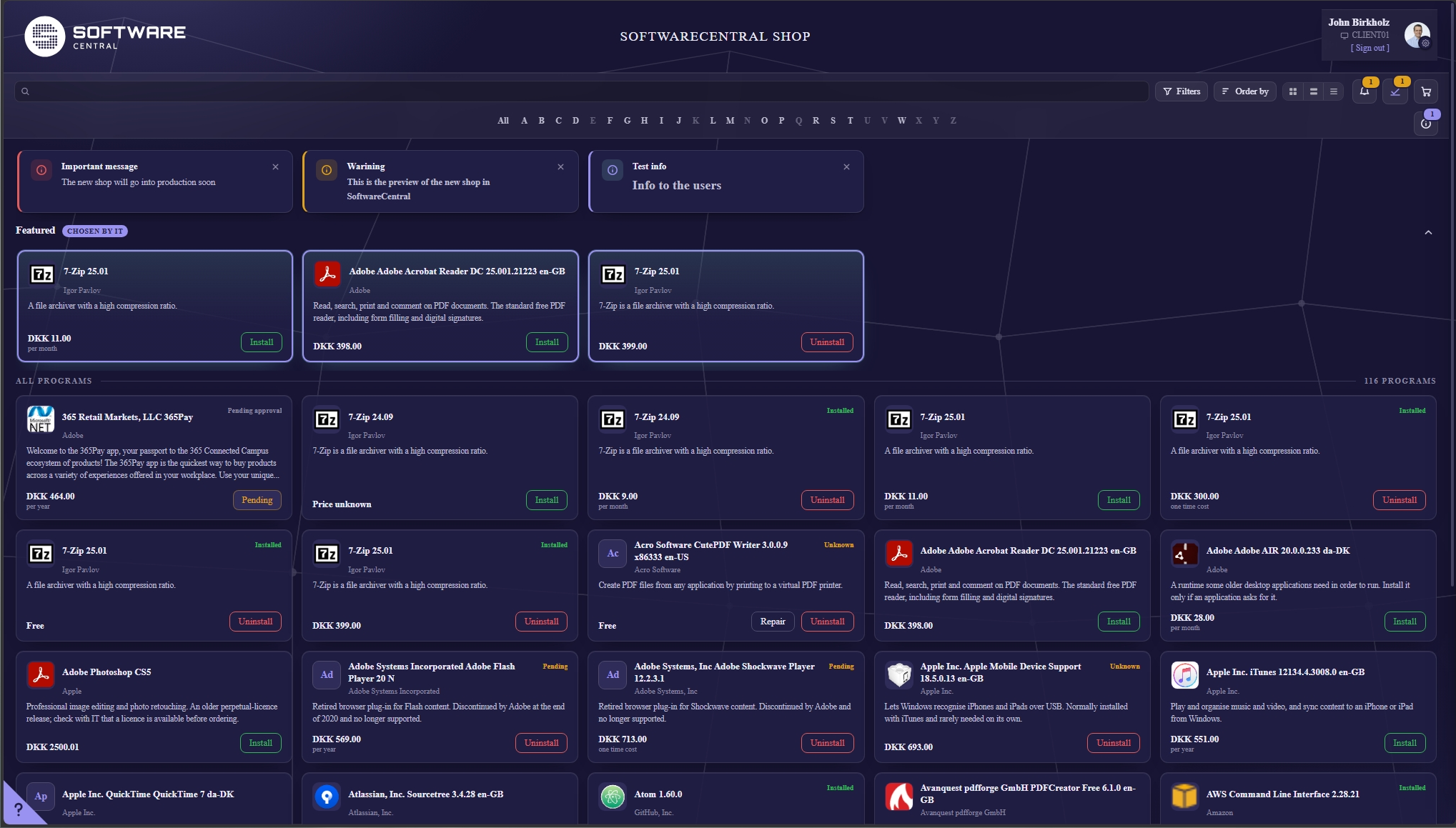
The same shop and the same catalogue, four times over. Forest carries its own logo as well as its own palette — which is the part that makes a theme worth the name, rather than a set of colours.
Every theme can be aimed at an Active Directory or Entra group, the same way a message from IT can. A department with its own branding gets its own logo and its own colours, and nobody outside it is offered them — their browser is never even sent the colours.
There is always one theme everybody can reach, and a theme used as the default is made available to everyone automatically, because a default that most people cannot see is not a default.
It stops at the shop. A theme reaches the new shop, My Account and the order receipt, and nothing else. The rest of SoftwareCentral, and the shop you use today, are untouched by it — so branding the shop for your users cannot change the console your administrators work in.
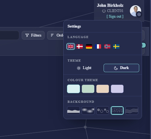
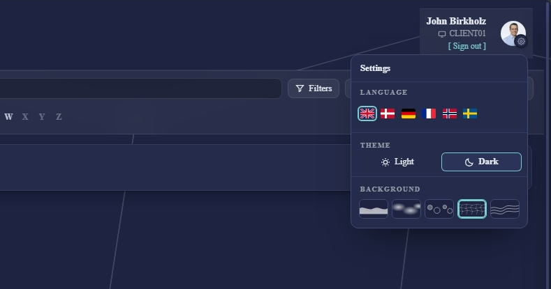
The shop knows who you are, so it says so: your picture and your name sit in the corner of the page, with a small gear on the picture itself. That gear is where everything personal now lives, instead of being spread between a menu, a profile page and a preferences dialog.
The background patterns are the one piece of this that is pure preference, and we went back and forth on whether to include them at all. They are deliberately faint — the job of the page is to make an application easy to find, not to be interesting to look at. Tell us if we have that balance wrong.
Most visits to a shop are someone looking for one specific thing. That path got the most attention.
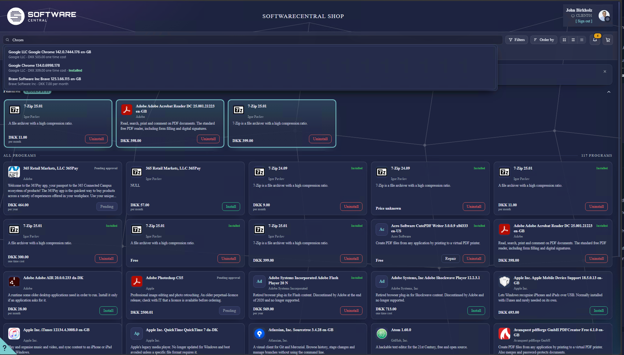
A conversation with a customer made something obvious that we had been half-ignoring: shop search only works if you already know what the software is called. Somebody who needs a browser searches for "browser" and finds nothing, because your catalogue says Mozilla Firefox and Google Chrome. Somebody who needs to open a ZIP file searches "zip" and gets whatever happens to have those three letters in its name.
This was the last section of this page when we first published it, described as an idea we had not started. It is built.
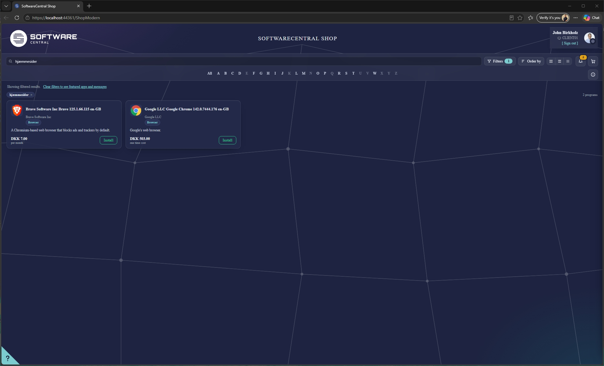
A search tag is a small label you attach to applications. It carries a name, a short description and a list of keywords — all of them in every language the shop speaks. Attach the "Browser" tag to Firefox, Chrome and Edge, and somebody searching for "internet" finds all three.
We ship around a hundred of them ready-made, covering the kinds of software most catalogues contain, translated into all six shop languages. They are yours to edit, switch off, or ignore entirely while you write your own — your users have words for things we would never guess, and internal names we could not know.
Assigning them is deliberately not a chore. You can open one tag and tick every application it belongs to in one list, rather than opening fifty applications to add the same label fifty times.
Tags only help if the search itself is willing to meet somebody halfway, so the matching was rewritten at the same time. It is a small amount of arithmetic, running inside your installation, and it does four things the old search did not.
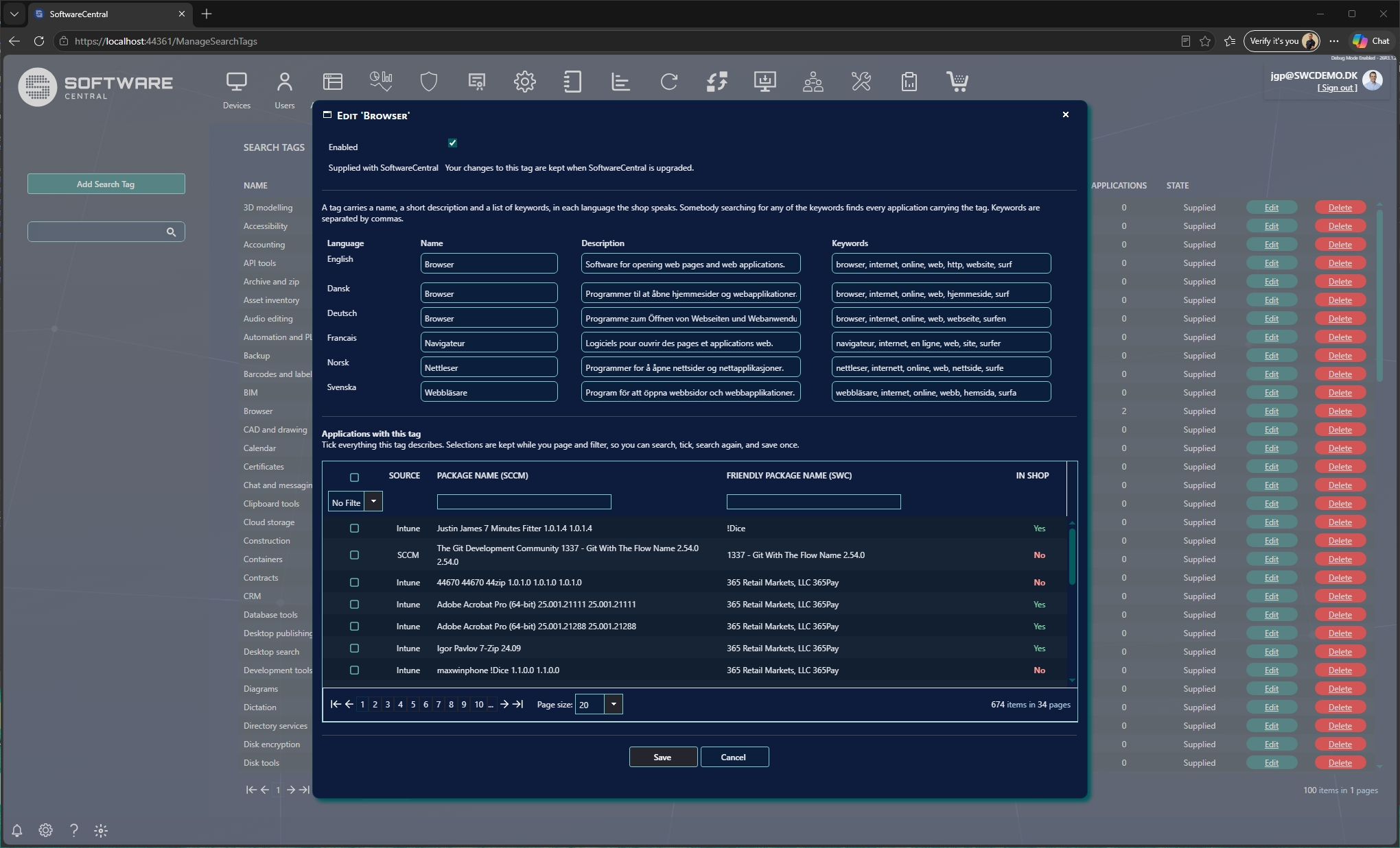
Those four compound, and the fairest way to show it is with the worst search we could think of. A Danish colleague types Hjæmmesidder. It is spelled wrong. It is in a language your catalogue is almost certainly not written in. It describes something whose name it does not contain. It is, in short, about as little to go on as a search box ever gets.
The shop returns Google Chrome.
The Æ was folded, the spelling forgiven, the word matched against the Browser tag in all six languages at once, and the tag pointed at the browsers you actually have in your catalogue. Not one character of it left your server.
The suggestion list as you type and the results you get on Enter are now produced by the same matcher. They used to be two different pieces of code that could, and did, disagree.
When a tag is what found something, the card says so — a small pill with the tag's name in your language and its description in the tooltip. Somebody who searched a vague word learns what they have found rather than wondering why Firefox appeared.
No language model, and that is a decision rather than a shortfall. The fashionable answer here is to put an LLM in front of the catalogue. That would mean your package names and your users' searches leaving your installation to reach somebody else's service, and for most of you that ends the conversation before it starts. Everything described above runs on your own server, against your own catalogue, and reaches nothing outside it.
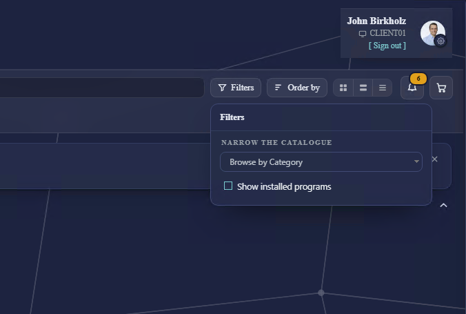
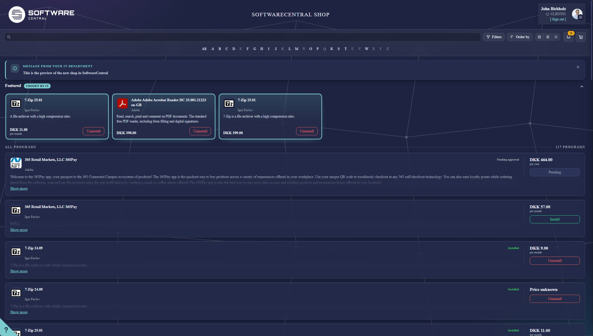
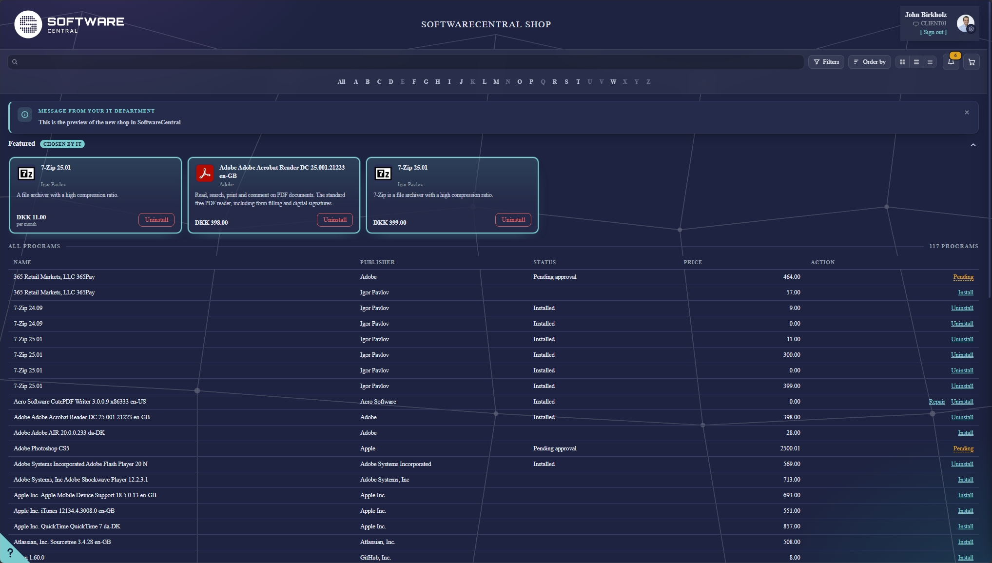
People do not all use a shop the same way, and a catalogue of forty applications does not want the same treatment as one of four hundred. So the view is the user's own choice, and it is remembered between visits.
A card can only say so much before it starts truncating. Details opens a sheet with the rest: the full description, the manufacturer, the version and the language, the price, whether it needs approval, and whether it is already on the machine.
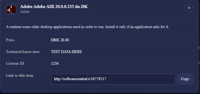
It also carries the people behind the application, which is the part users actually ring about — prime contact, support, technical know-how, super users, the application owner and the fixed approver, wherever you have filled them in. And the search tags the application carries are listed too, so somebody can see how it is filed rather than wondering why it turned up in their search.
Those contact fields have been the same fixed set for years. Now you can define your own — a ServiceNow reference, an internal wiki page, a licence note, a cost code — as text, as a number, or as a link with its own caption.
You define a field once and fill it in on the packages that have one; it appears on those and nowhere else, so defining twenty fields does not give every application twenty empty rows. Names are written per language like everything else in the shop. Links have to be real http or https addresses, and every change is written to the log with what the value was and what it became — not merely that somebody opened the window.
Every application has a link straight to it, with a Copy button beside it, and it is now short enough to drop into a ticket or a chat message: /s/PS100042 rather than a query string. Whoever opens it lands on that one application — and on whichever shop they are meant to be using, which is what makes it safe to hand out while you are still running a pilot.
Applications whose identifiers come from Intune keep the full-length link. Those identifiers cannot be shortened without inventing a code and a table to keep it in, and we would rather give you a long link that works than another script to run. The link works either way; only its length differs.
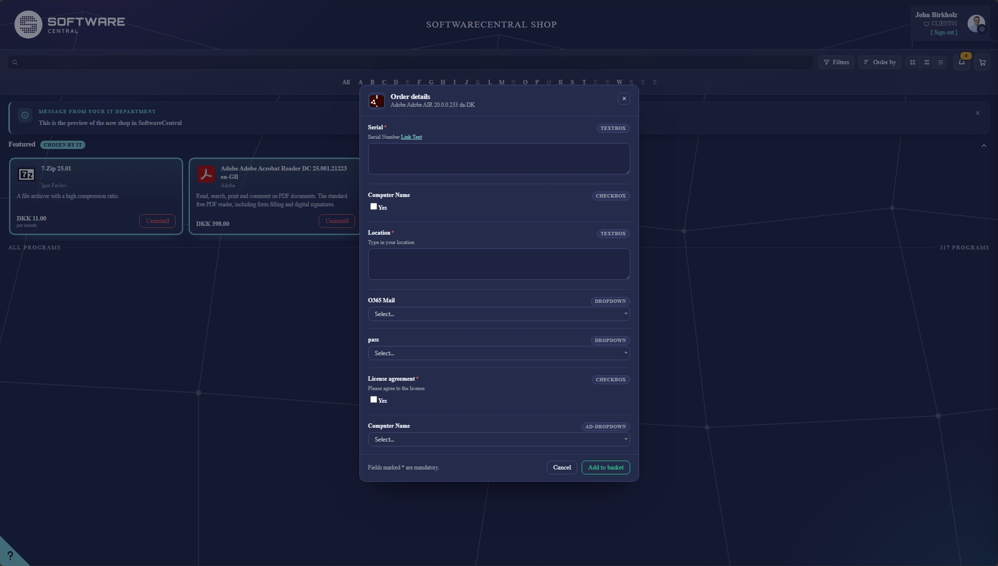
Some applications cannot simply be installed. They need a licence key, a cost centre, a server to point at, an organisational unit, a named user. In the old shop those questions were a plain form; in the new one they are a panel that slides over the catalogue, headed by the application's own icon and name, so it is obvious what you are answering for.
The questions are asked before the item reaches your basket — the button at the bottom of the panel is Add to basket, not Save. An order is therefore complete at the moment it is placed, rather than being chased for details afterwards.
The fields are whatever you have defined on the package: free text, a tick box, a fixed list, a list built by a script, or a live lookup into Active Directory, Configuration Manager users, Microsoft 365, an organisational unit or a computer template. Mandatory ones are marked, and the panel will not let the item through without them.
Ordering is a basket rather than an item-at-a-time flow: add several things, review them together, order once. The basket shows a running count, opens as a drawer over the catalogue rather than taking you off the page, and closes itself when you empty it.
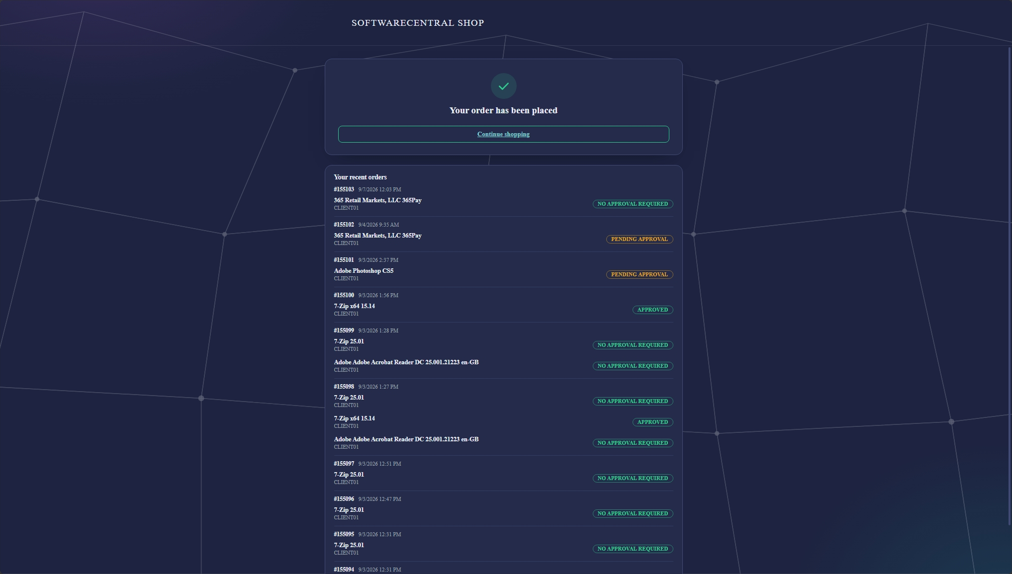
After checkout there is a receipt — the order number, everything in that order grouped together, and your recent orders with their current status underneath. Previously an order simply disappeared into the approval queue.
Where this one stands: the basket and checkout work end to end and we have placed real orders through them. We are now working through the less common routes — orders needing approval, orders that carry custom fields, and machines with more than one network address — before we call it finished.
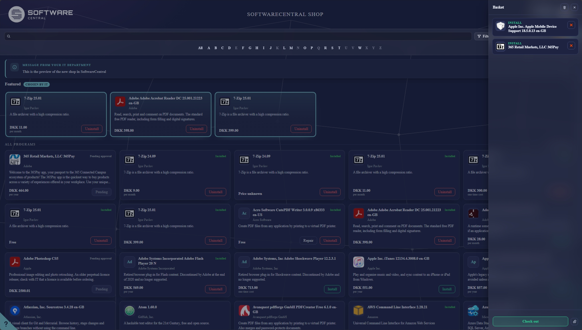
The commonest support call a shop generates is "I ordered it, has anything happened?". So the state is on the item itself: Pending while an approver has it, Installing once it has been handed to the client, installed when it is done. Those are different situations and they no longer look the same.
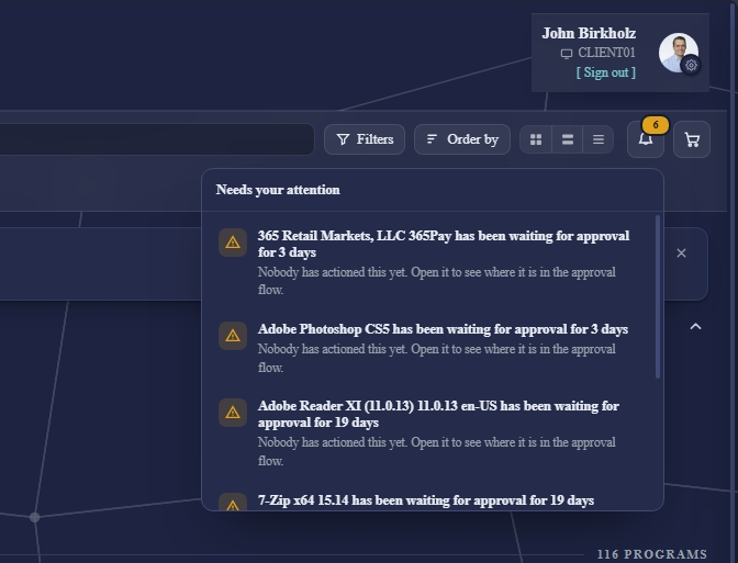
Alongside it there is a Needs your attention panel — for the orders that have quietly stopped, most often an approval nobody has acted on. It is easy to lose an order in an approval queue; this is the thing that tells you before the user rings.
The same panel now carries the outcome of an order and not only its stalling. One that has been approved says so in green, one that has been declined says so in red, and on a request that went to several approvers the notice waits until they have all finished rather than announcing the first one. Each stays for two days and then goes on its own — news about your own order is not a task, and there is nothing to tick off.
When an approver sends an order back for more information, or declines it outright, the reason they typed is now shown to the person who raised it — in the basket beside the item, in the notice, and on the order in My Account. It was always stored and never shown to anybody; worse, a sent-back order used to tell the requester it was "waiting for" the very person who had just handed it back to them.
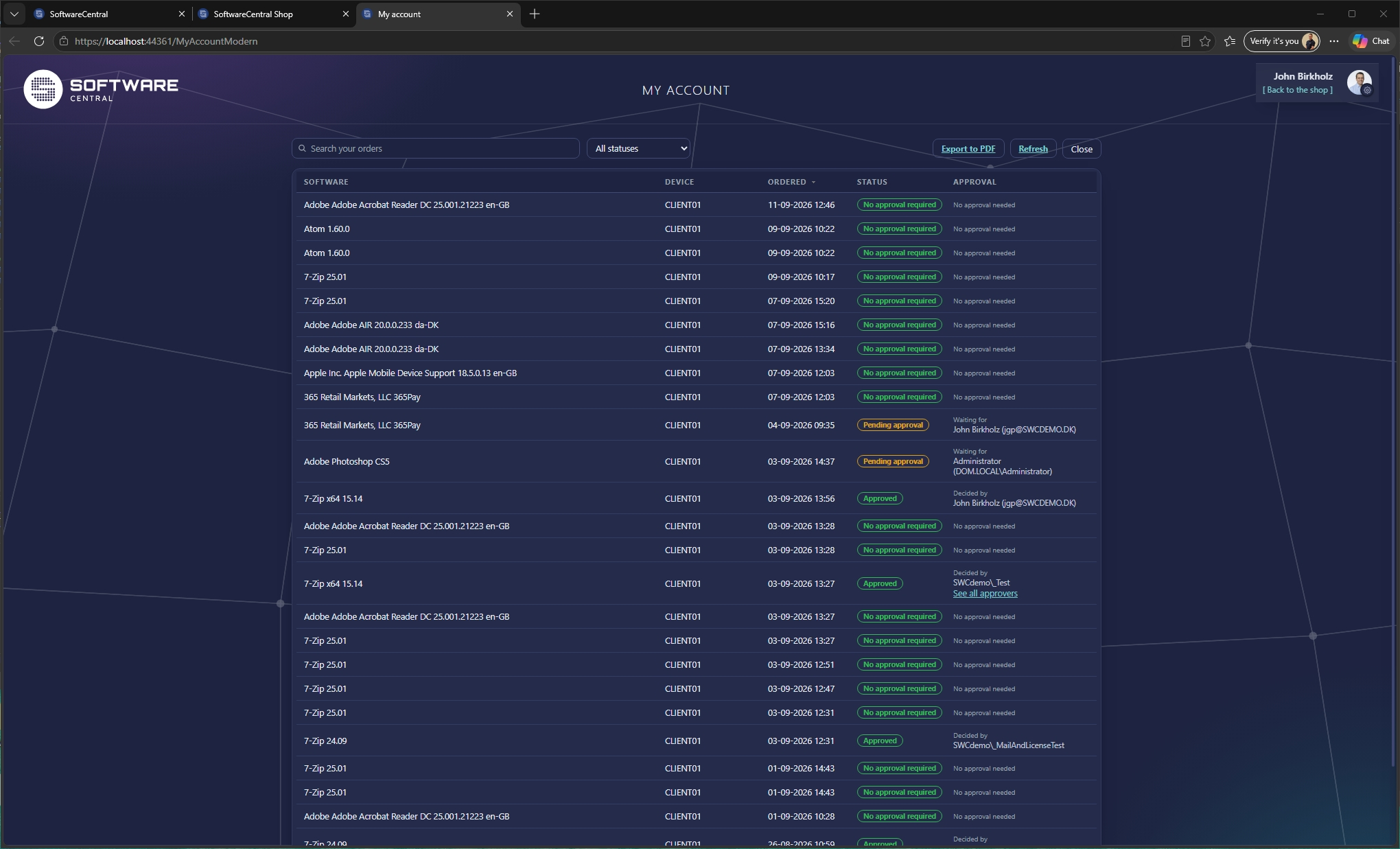
My Account has been rebuilt to match the shop, and it answers a question the old page could not: who is this waiting on?
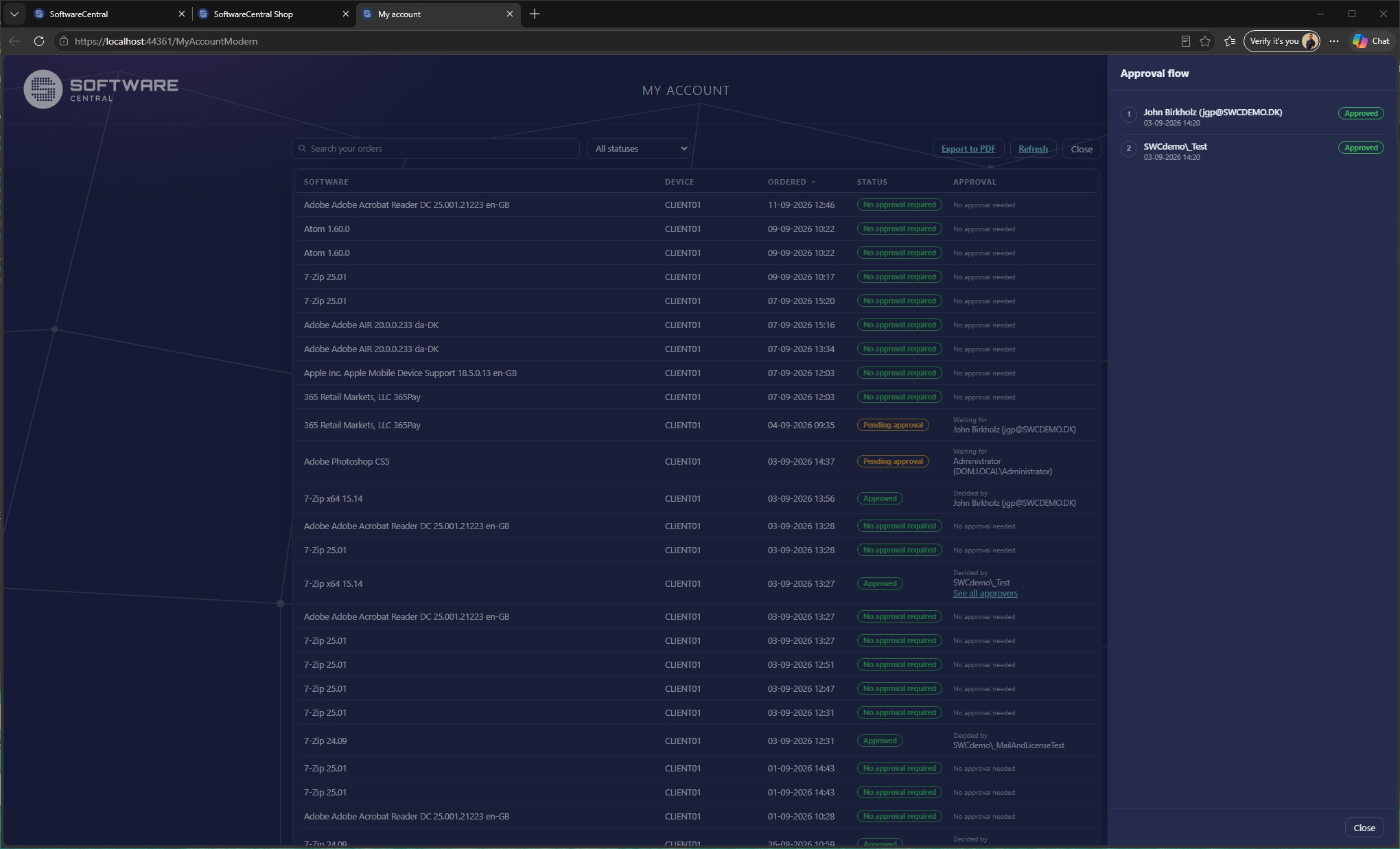
Every order shows the person it is sitting with right now. Where an order needs several approvers, See all approvers opens the whole chain — each step, who it went to, what they decided and when. "It is in approval somewhere" stops being the answer.
Alongside it: a search across your own orders, a filter by state, and an export — and the export covers the whole list, not the page you happen to be looking at.
An approver found out that somebody was waiting on them by email, or not at all. The shop now says so directly: a counter beside the basket, and the same counter in My Account, both linking straight to the approval page. When you have nothing waiting it is not there at all, so it is only ever a real signal.
It is deliberately the mirror of the attention panel rather than part of it. That one is about your orders, held up by somebody else; this is about other people's orders, held up by you. A good many people have both at once, and folding them together would have made each of them mean less.
The number is produced by asking the approval page what it would show, rather than by a second piece of code counting the same thing a slightly different way. That sounds like an implementation detail and is not: it means approvals assigned to a group, approvals delegated while somebody is away, and multi-step flows where only one step is live all count exactly once — and the number always agrees with the page it sends you to.
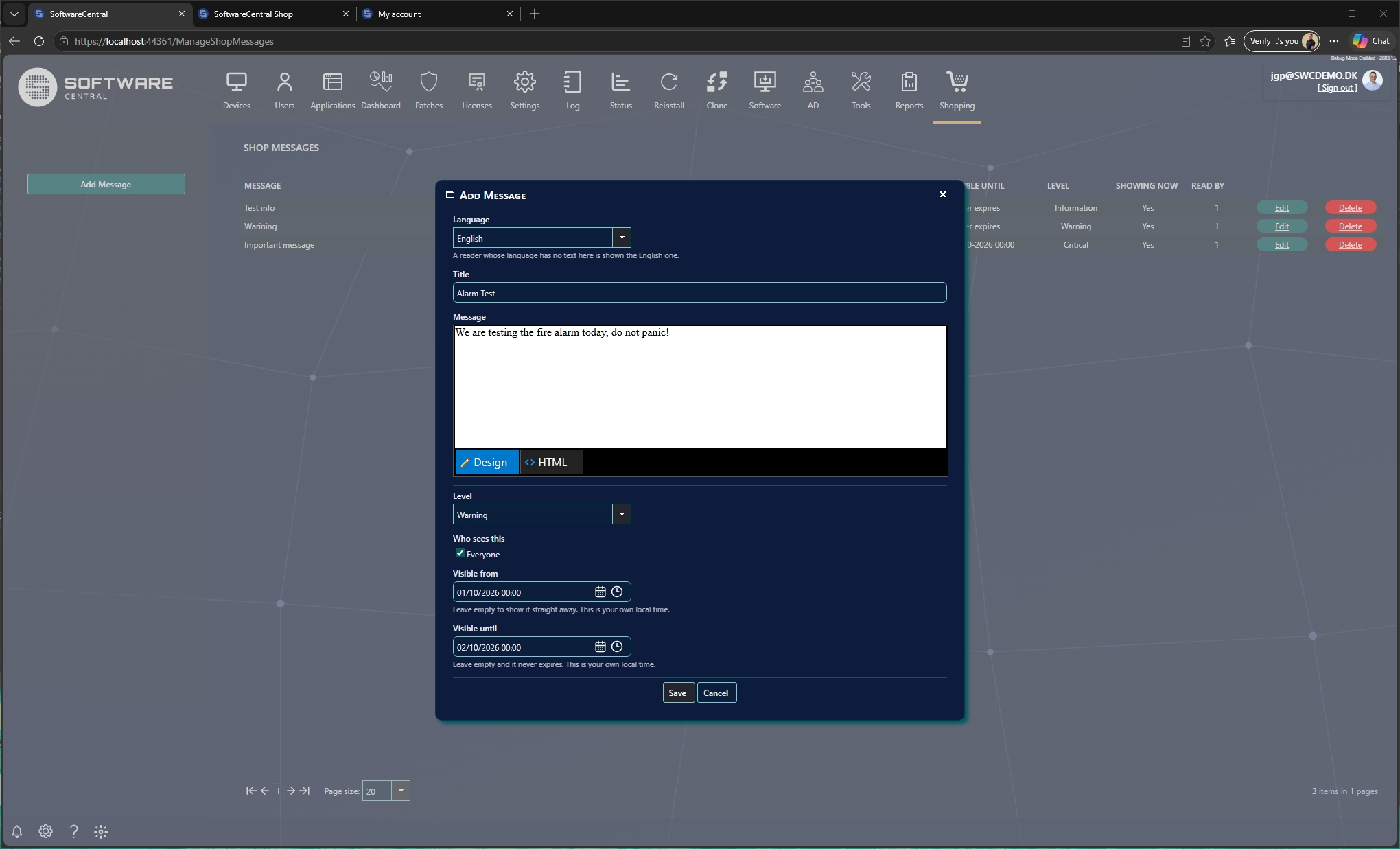
The shop has always been able to show one message from IT. One, for everybody, until somebody remembered to delete it.
Now you can write as many as you need, and each one carries three things the single message never had:
They are written per language like everything else in the shop, and a reader whose language you have not filled in sees the English one rather than an empty box.
Messages sit in a single row above the catalogue — with arrows if there are several — so three notices cost one row rather than half the page. A user can dismiss one they have read, and it stays dismissed on every device they use. If you edit the text afterwards, it comes back, because it is now a different message.
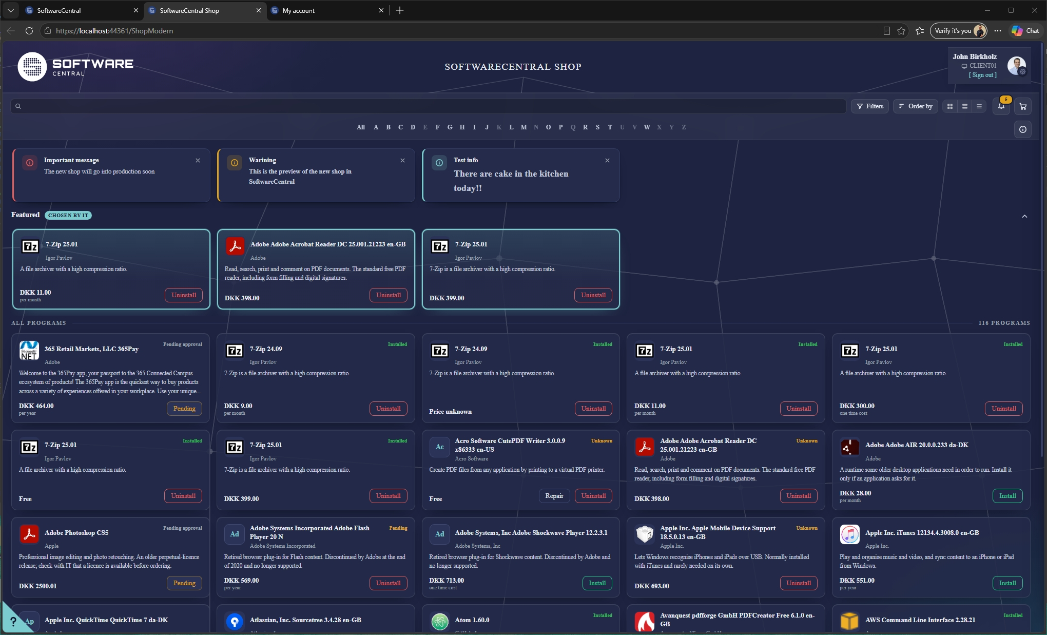
The new shop runs beside the one you use today, and you decide who sees it.
Start with a pilot group. Point a setting at an Active Directory or Entra group and its members get the new shop. Everybody else carries on exactly as before, on the same catalogue and the same orders. Add people to the group as your confidence grows; remove them and they are back where they started, immediately.
Then switch it on for everyone, with one setting — and this is the part worth reading twice: the address does not change. Links in your intranet, bookmarks, shortcuts, the menu button, anything you have documented internally — all of it keeps working and keeps pointing at the right shop. There is no list of URLs to hunt down, and nothing to tell your users.
If the new shop ever turns out not to suit you, turning the setting off puts everyone back.
None of this is built. It is written down to be argued with — if one of these matters far more to you than the others, that is worth telling us, because the order is not fixed.
For everything else that is planned across SoftwareCentral, see the roadmap.
Four things that were on this list when the page was last published have since been built, and have moved up into the sections above: the details view, your own fields on it, the short link, and the counter that tells an approver somebody is waiting on them.
And the questions we would still like answered:
This is unreleased software, shown here while it can still change. It is not finished, and that is the point — an opinion is worth far more to us now than it will be once it ships.
Anything at all: something that looks wrong, something missing, something you would never let your users near. Short replies are welcome, and so is "we would never use this".
Write to support@softwarecentral.com
Mention which part you are writing about and it will reach the right person.
SoftwareCentral · shop preview · last updated 21 September 2026.
Screens on this page are from a development build and will change before release.
© 2026 Robopack · SoftwareCentral Update ·
Roadmap ·
Follow us on LinkedIn